We may earn a commission for purchases using our links. Learn more.
Last week we shared an update video walking through near final samples Kevin and I picked up during out recent factory visit.
This week we're ready to reveal the new box design for the iPhone 17 series Clicks Keyboard Case.
We believe that the care that goes into a box is a reflection of the care that goes into the product inside it.
After all, the box is the first physical experience you have with a product!
This is especially true for Clicks, a product that is fundamentally tactile by nature.
One of the most common comments we get from customers is that Clicks is "satisfying" to type on. We want our box to be equally satisfying!
A decision we made early on was to adopt a 'matchbox design' instead of a traditional lift off box. It reflects our desire to put the keyboard front and center.
When you pull on the satin tab connected to the bottom of the tray, the first thing you see as it slides out is the keyboard itself. It's the star of the show.
Another little Easter egg incorporated into the front panel of the box is a raised surface across the keyboard. It's a subtle touch, but again it aims to reinforce the attention to detail that goes into the design of our keyboards and the tuning of our keys.
The hero image chosen for this year's box front reinforces one of the key benefits of the new Clicks for iPhone 17 industrial design. The contoured side enclosure of the case allows the natural color of iPhone to stand out, along with the native buttons.
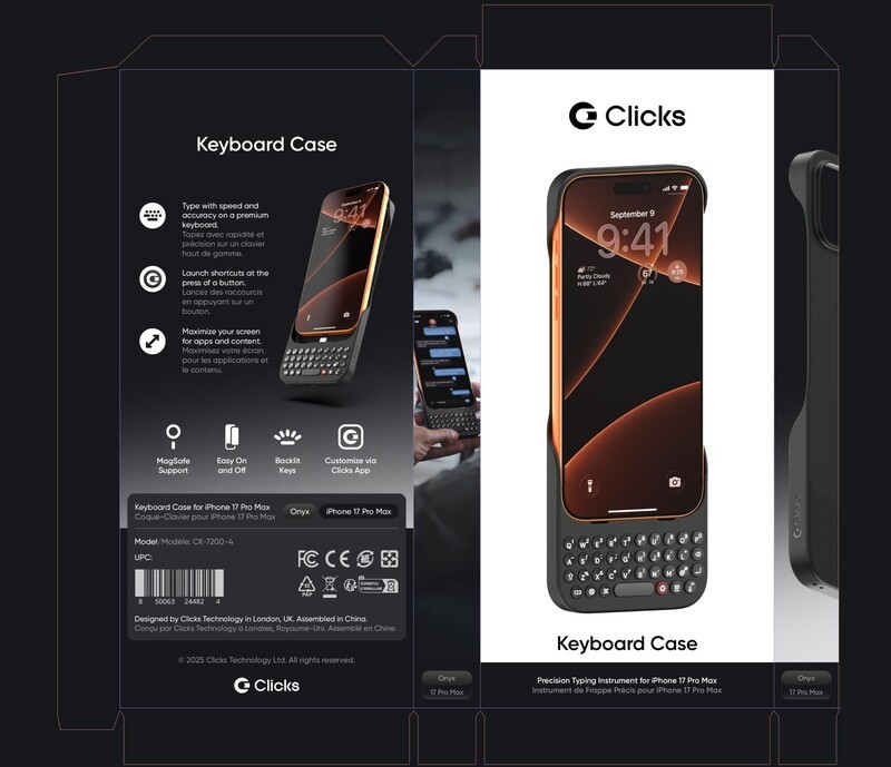
This year's box incorporates some lifestyle imagery on the spine as a subtle nod to the key benefits of added screen real estate and staying connected and productive on the move. It also reinforces the most comfortable way to hold Clicks for optimal typing and adds some humanity alongside the functional product imagery.
As we learn more about the way our tens of thousands of customers use the product, we've started to talk more about how Clicks is both a keyboard AND a case in one.
To us, that seemed evident in our previous models, but we decided we could (and should) make that message stronger on this year's box. It also helps reinforce keyboard cases as a distinct product line… the reasons for this will soon become more clear 😉
Choosing how to use the limited real estate on the back is always a difficult decision. We opted for a photo that reinforces Clicks is a keyboard case that you add to your phone (in case there was any confusion) alongside key features and benefits we've heard our customers value most.
On the bottom of the sides, we also add a reminder of the model and color, a small but important detail for retail where the product may be merchandised like a book shelf (side out) to maximize shelf space.
I've gone on longer than planned, but as I started composing this message, more of the decisions and thoughtful details that went into our box came to mind.
Looking forward to getting our new box and latest Clicks Keyboard case into your hands.
Hats off to Erik from team Clicks who continues to push our design and packaging experience forward.
Gadway
Typed on a Clicks for iPhone 17 Pro, with a cross body strap, while walking on the treadmill at 3.5 miles per hour at a 6 degree incline
Discover Clicks for iPhone 17 Series
Read more
Clicks for iPhone 17: Thinner and Lighter... with the same Perfect Click!
Learn what's new in the Clicks Keyboard for iPhone 17. Available for the iPhone 17, 17 Pro and 17 Pro Max.